
Building a world of payment possibilities.
KEVIN.

When I joined kevin. as Chief Brand Officer, the company had a purpose that did exactly what purpose statements are supposed to do: it fired people up.
"Fuck legacy."
While “Fuck legacy” energised the team internally, it framed the company as the underdog fighting the giants, and not as the architects of something fundamentally new.
kevin. was building something genuinely first-of-its-kind in payments — real potential to define a new category entirely. But the identity was anchored to what the company was fighting, not what it was making possible.
There was a specific credibility problem underneath this. kevin.'s audience wasn't consumers – it was global enterprises and financial institutions. Organisations for whom trust and reliability are the entry requirement. A brand built around disruption and rebellion sends exactly the wrong signal to exactly the right audience.
The right question changes everything.
The conversation changed when we asked a different question: what does this technology actually make possible? Co-founder Pavel described a moment that happened regularly in pitches – he demonstrates a transaction, and the room, usually full of payment experts, goes silent.
People stopped thinking about limitations. They started seeing possibilities.
That was the insight. kevin. wasn't replacing card networks. It was enabling something they structurally couldn't offer: freedom. Direct control of payment flows, without intermediaries, without unnecessary steps. Not a challenger fighting legacy players, but an enabler building a world of payment possibilities.
From that reframe, three beliefs were established from the founders' vision and internal workshops, each with a direct output: the purpose – to build a world of payment possibilities; the mission – to free partners from the pains of legacy payments; and the onlyness – clean-slate infrastructure built from scratch, not patched on top of a flawed system. These became the criteria decisions were made from, not just lines used in marketing.
One repositioning.
Everything else followed.
The shift wasn't a messaging change. It became a strategic lens that ran through the whole organisation. Investor conversations changed – from 'we're taking on the card networks' to 'we're enabling a category of merchant freedom that didn't exist before.' Hiring attracted builders and architects rather than fighters; people who wanted to create foundational infrastructure, not dismantle something old. Product decisions had criteria to be made from. And the brand began signalling the reliability and intelligence that enterprise and financial institution partners needed to see before trusting a new piece of infrastructure with their payment flows.
The repositioning also shaped how kevin. talked about itself internally. The employer brand – built on the same platform – gave the company a language for its culture that matched the ambition: creating first times, building with freedom, embracing the uncomfortable. Not a startup pretending to be a family. A company that knew exactly what it existed to build, and hired accordingly.

Old visual identity.
From an playful astronauts to the invisible magic ingredient.
The original kevin. brand had a playful, irreverent quality – an astronaut blowing bubble gum on the homepage. Distinctive, but sending the wrong signal for a company that needed to earn the trust of global enterprises moving money through their infrastructure.
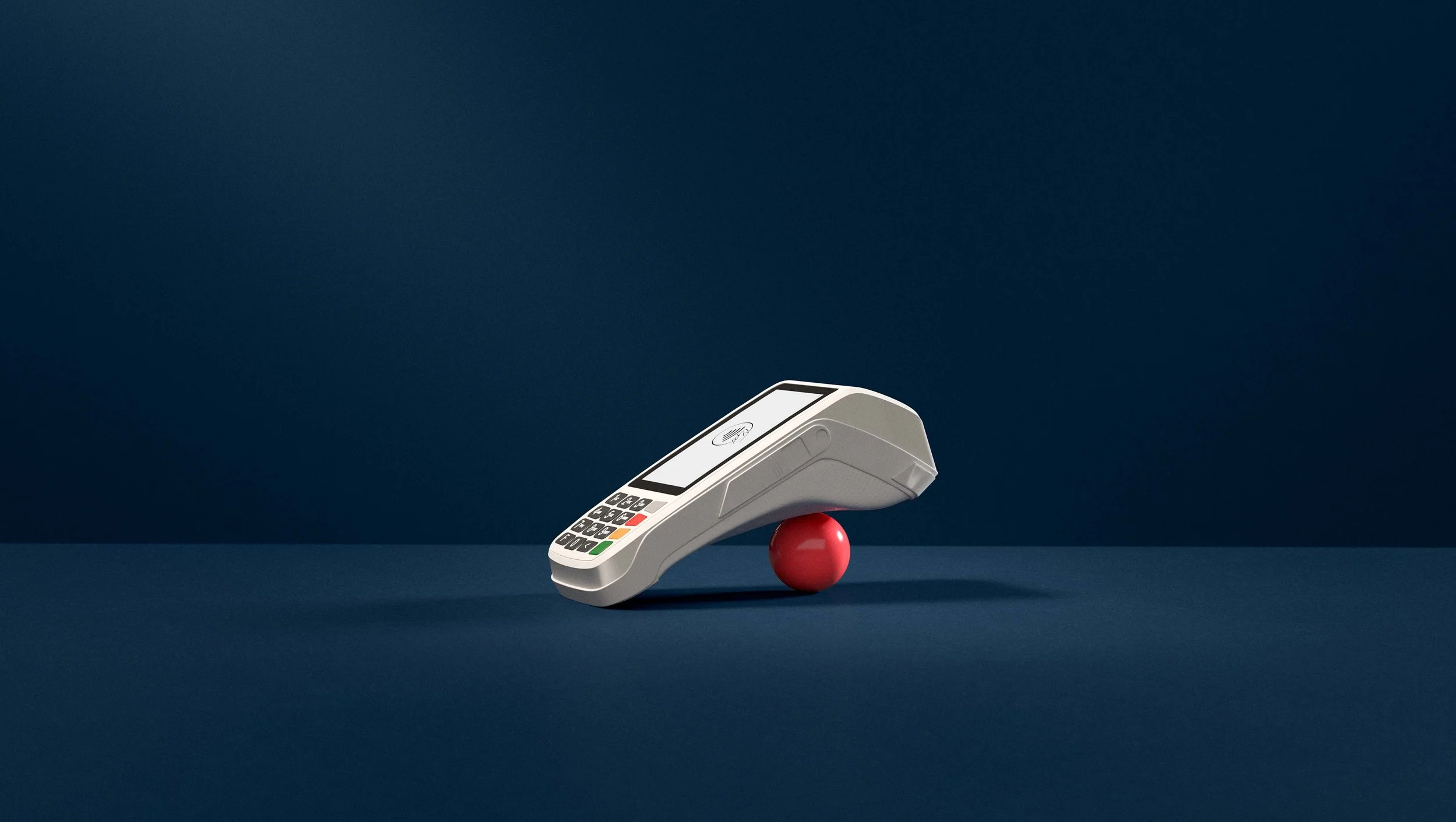
The new identity was built from the same enabling logic as the repositioning. The red ball became the central symbol for kevin. as the invisible ingredient moving through the ecosystem, enabling new moments of possibility for merchants and partners without ever being seen by the end customer. Its intensity, texture, and the symbolic moments it creates communicate what kevin. does: not visibly, but fundamentally. The brand didn't describe what kevin. was against. It showed what kevin. made possible. And that – more than any logo or colour – is what brand as a business capability looks like.


The new brand identity – kevin. as the invisible magic ingredient.