Making Virgin Atlantic red hot again.
VIRGIN ATLANTIC
There are companies you admire long before you ever work for them. Virgin Atlantic was one of mine.
I'd spent five years inside the Virgin group, building brand across different parts of the group. But I’d been a loyal Virgin Atlantic customer long before that – someone who genuinely believed they did flying better than anyone else.
So when the new Head of Design asked me to join the creative brand team, it didn’t feel like a career move. It felt like the chance to help shape something I’d admired for years.
Bold. Human. Unlike anyone else in the sky.
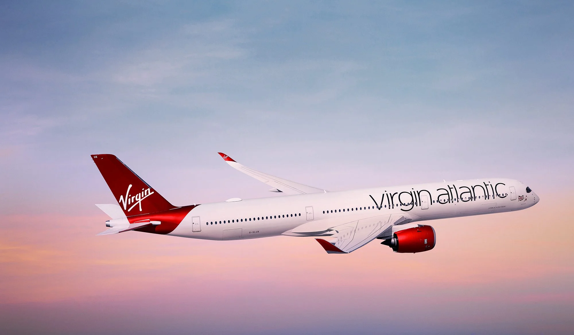
Virgin Atlantic is Britain’s second-largest carrier and one of the most recognisable brands in the air. But in recent years, the brand had lost clarity – visual inconsistencies, conflicting signals, and a palette that had drifted toward pink with the launch of the new brand platform Depart the Everyday, quietly moving red away from the prominence it had always held.
The brand tracking had confirmed what some of us already sensed: the visual language, and red – the brand's most distinctive asset – had drifted far enough that customers were beginning to misattribute the brand for competitors.

From any airline to unmistakably Virgin Atlantic.
Re-establishing red as the dominant visual signal immediately restored coherence to the system. The brand regained a clear visual anchor – one that passengers, staff, and partners already instinctively recognised.
Audiences already knew what to expect from other airlines. Virgin Atlantic had never been that predictable. Instead of competing signals, the brand began reinforcing itself – with more clarity and confidence than it had shown in years.


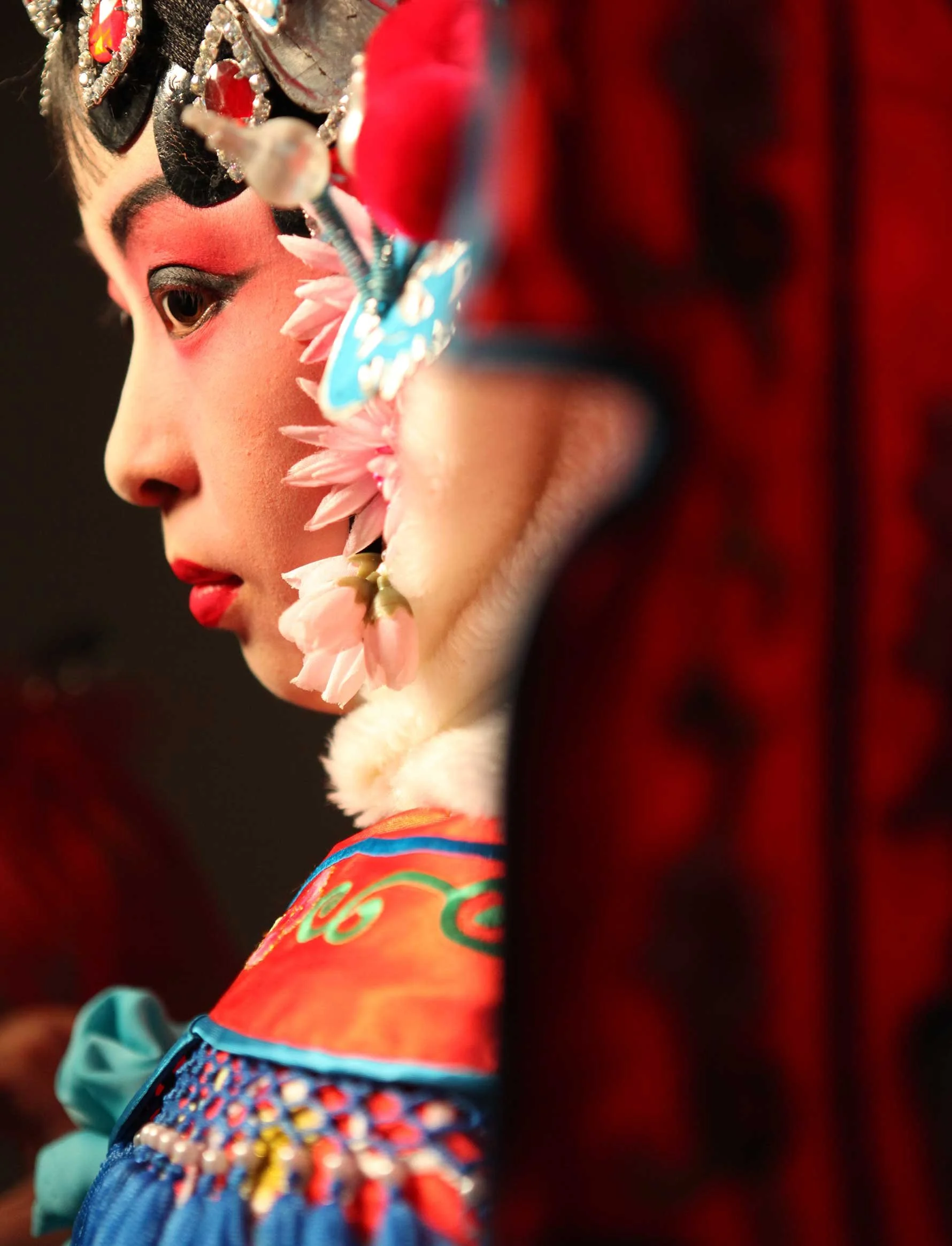
See the world differently.
Bold and dynamic destination imagery can visually transport you to faraway locations, build anticipation and inspire travellers to embrace new experiences around the world.
But frequent use of the same-same destination imagery of wide shot skylines and traditional shots of tourist hotspots had become predictable and stale, and wasn't differentiating Virgin Atlantic from other airlines.
I developed new art direction principles that gave the team a clear alternative to the generic travel imagery that most airlines default to. Interesting angles and viewpoints, clever use of reflection and perspective, intriguing takes on familiar destinations – always with a presence of red. Images that could only belong to Virgin Atlantic.